Crescent Angus
PROJECT Logo Suite Design YEAR 2026
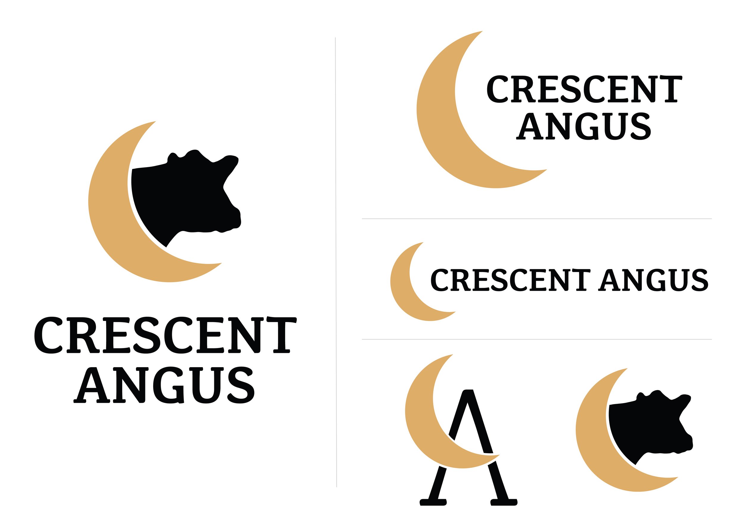
For Crescent Angus, I built a flexible logo system around a single visual idea and developed it into a full suite including a stacked primary mark, a horizontal lockup, a condensed version for tight spaces, a simplified icon for small-scale use, and a monogram that uses the crescent's negative space to form the operation's initial. Paired with a bold, structured serif and a warm gold-and-black palette, the system stays consistent and recognizable across signage, print, embroidery and digital applications.